


Table of Contents
There is a lot more to making beautiful jewelry than just picking out pretty stones. However, how well the stones are matched together will have a big impact on how professional the piece looks. If you know how to match colors when making handmade jewelry like earrings, necklaces, or rings, you can take your designs to the next level right away.
This guide's goal is to give you helpful tips on how to use the colors of gemstones to match them. This will let you make things that look like they all mean something together.
Why Color-Based Gemstone Pairing Matters in Jewelry Design
Before a person recognizes the quality and type of materials in a jewelry piece, the color of that piece will have already influenced how they emotionally respond to it. A combination of colored gemstones that balance with each other creates a more luxurious and thoughtful appearance, whereas the use of poorly colored combinations will reduce the beauty of even the highest-quality gemstones by making them appear uncoordinated and therefore, unfashionable.

Using appropriate colors together helps:
- Create visual balance
- Guide the viewer’s eye throughout the design
- Increase the perceived value of the product
- Strengthen brand recognition for designer and hand-crafted jewelry makers
- Attract more customers and increase sales.
The use of color harmony for jewelry designers is not just for aesthetic reasons; it is a business decision.
Understanding Basic Color Theory for Jewelry Makers
The basics of pairing gemstones together are color theory, which any person can use to successfully pair stones, even if they are not a designer.
Color Basics:
- Hue - actual color (i.e., blue, red, green)
- Value - amount of lightness or darkness in the color
- Saturation - the amount of intensity or softness in the color
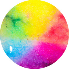
Color wheels are a way to show organized relationships between colors in a way that helps create usable color systems.
- Complementary (color opposites),
- Analogous (color neighbors),
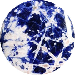
- "Monochromatic" refers to a color family that shares the same hue.

These systems work just as perfectly with gemstone designs as they do with anything else.
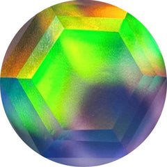
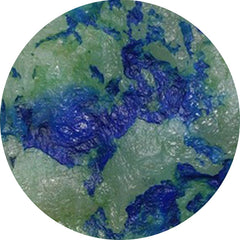
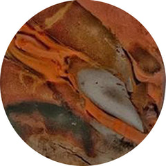
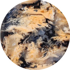
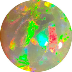
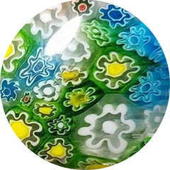
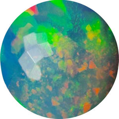
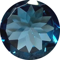
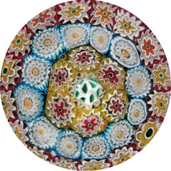
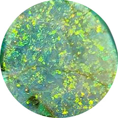
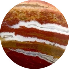
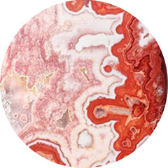
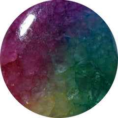
Complementary Gemstone Color Combinations That Create Contrast
Each color on the wheel will have its opposite, or complementary, color. By using these pairings, you can create a high level of contrast and an extremely high level of visual interest in your signature pieces of jewelry.
Strong complementary pairs:
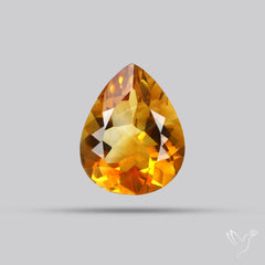
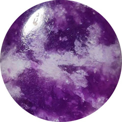
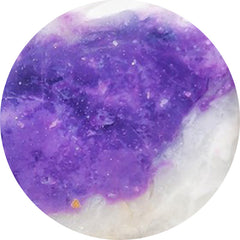
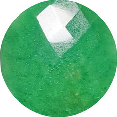
- Amethyst + Citrine (purple + yellow)

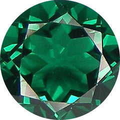
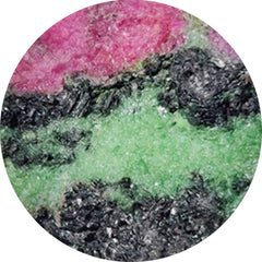
- Ruby + Emerald (red + green)

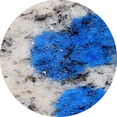
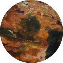
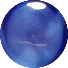
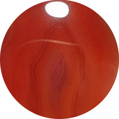
- Blue Sapphire + Orange Carnelian (blue + orange)

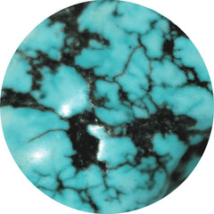
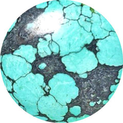
- Turquoise + Coral (light blue + red-orange)

Design tips:
Choose one stone as the primary color, and use the other physical stone as an accent. Using both colors equally will create an overwhelming effect.
Best For:
- Statement necklaces

- Cocktail rings

- Dramatic earrings

- Artistic collections of jewellery

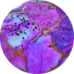
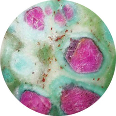
Analogous Gemstone Pairings for Soft, Harmonious Designs
Colors that are adjacent to one another on the color wheel are called analogous colors when combined with other colors. Use these colors in your day-to-day jewelry, as they are associated with calmness, sophistication, and harmony.
Examples of analogous gemstone combinations:
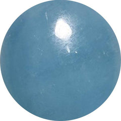
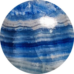
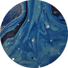
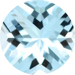
- Aquamarine + Blue Topaz + Sapphire (blue family)

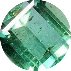
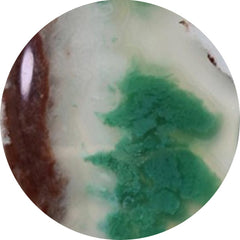
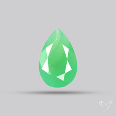
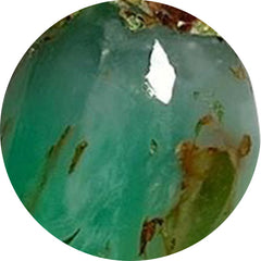
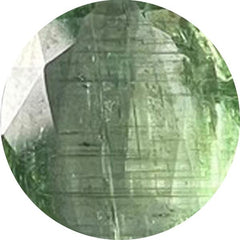
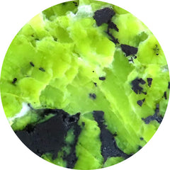
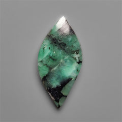
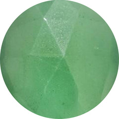
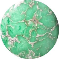
- Peridot + Green Tourmaline + Emerald (green family)

- Citrine + Yellow Sapphire + Golden Topaz (yellow family)

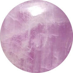
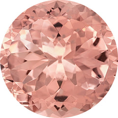
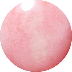
- Rose Quartz + Morganite + Pink Tourmaline (pink family)

Two color families that complement each other create harmony, luxury, and a sense of visual ease.
if you want to know you can price handmade jewelry, then you can read How to Price Handmade Jewelry with Loose Gemstones now.
Best uses for these color families include:
- Bridal jewellery

- Minimalist collections

- Layers of necklaces

- Fine jewellery styles

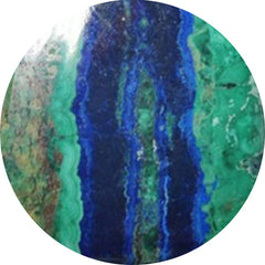
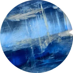
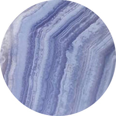
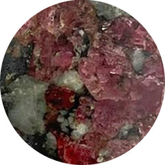
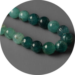
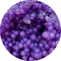
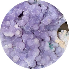
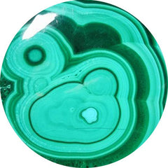
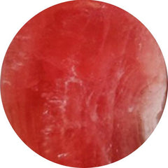
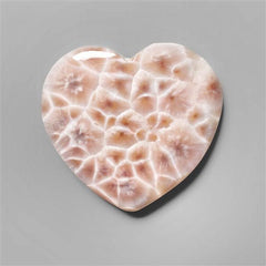
Monochromatic Gemstone Designs for Elegant Jewelry
Different shades of the same color are used in monochromatic designs. This adds depth without making things look messy.
Here are some examples:
- Light blue aquamarine + deep blue sapphire

- Pale pink morganite + dark pink tourmaline

- Light green prasiolite + deep emerald

Why it works:
- Looks fancy and expensive
- Gives texture to the picture
- Simple to style
- Appeal that never goes away
Monochromatic gemstone jewelry is a very effective way to brand luxury goods.
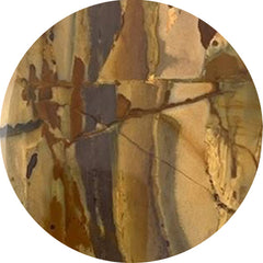
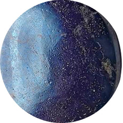
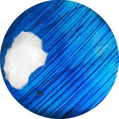
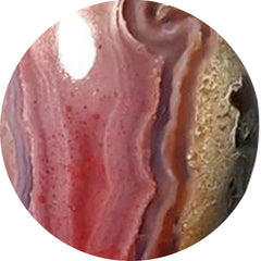
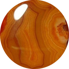
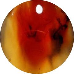
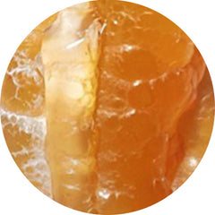
Warm vs Cool Tone Gemstone Pairings
Knowing how temperature affects color makes it much easier to match gemstones.
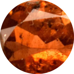
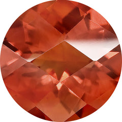
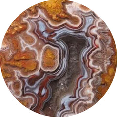
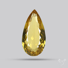
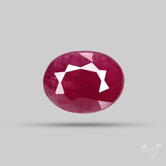
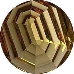
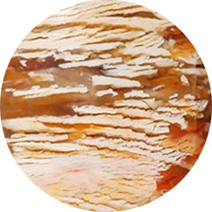
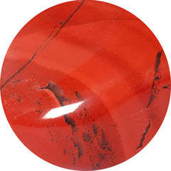
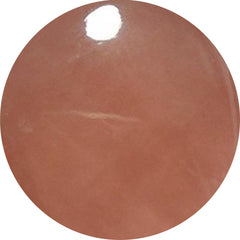
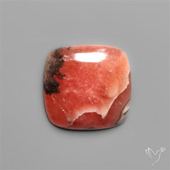
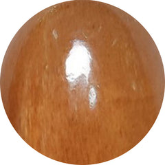
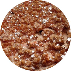
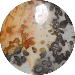
Gemstones with a warm tone:
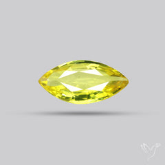
- Citrine

- Garnet

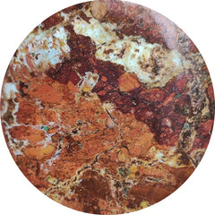
- Carnelian

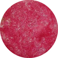
- Ruby

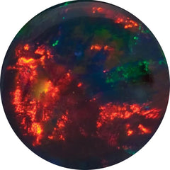
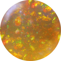
- Fire opal

- Amber

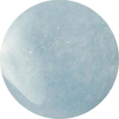
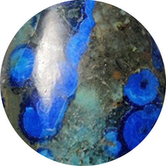
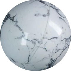
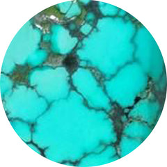
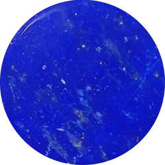
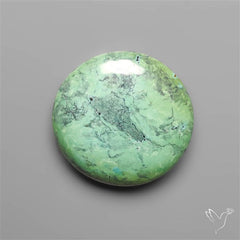
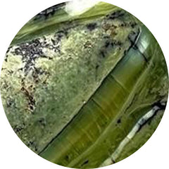
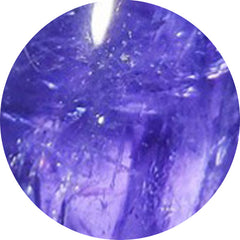
Gemstones with cool tones:
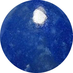
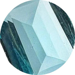
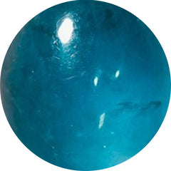
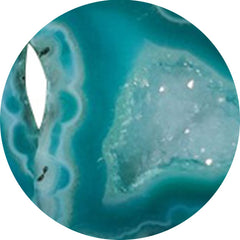
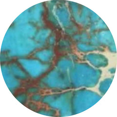
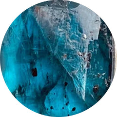
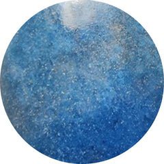
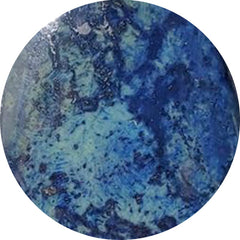
- Aquamarine

- Sapphire

- Amethyst

- Tanzanite

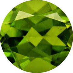
- Peridot

- Turquoise

How to pair strategies:
- Warm + warm: makes designs that are rich, cozy, and earthy
- Cool + cool: looks that are clean, calm, and modern
- Warm and cool: statement pieces with a lot of contrast that catch the eye
Example:
- Citrine and amethyst together make a warm or cool contrast that works well with nature.
Want to choose the right tools for your setup? Explore this comprehensive guide to jewelry-making tools to build a workspace that fits your skill level.
Popular Gemstone Pairings That Sell Well in Handmade Jewelry
Some combinations of gemstones do well in the handmade market all the time because they feel familiar, balanced, and emotionally appealing.
Most popular combinations:
- Amethyst and Rose Quartz for love and spirituality

- Turquoise, silver, and coral boho style

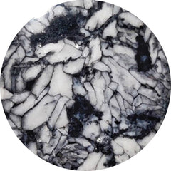
- Black Onyx and Clear Quartz, simple luxury

- Moonstone and Labradorite are mystical, neutral colors

- Emerald and Pearl's timeless beauty

These combinations look good on rings, necklaces, earrings, and bracelets.
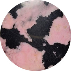
How to Choose Accent Stones for Rings and Statement Pieces
Accent stones should not compete with the main gemstone; they should support it.
How to choose accent stones:
- Darker center stones look better with lighter tones.

- Neutral tones make bright colors stand out.

- Clear stones make colors look brighter.

The best accent stones are:
- Topaz in white

- Clear quartz

- Moonstone

- Diamond

- Pearl

- Light aquamarine

Some examples of combinations are
- Ruby center with diamond accents

- Center of sapphire and topaz on top

- Emerald center with pearl accents

This structure makes things look clearer and more luxurious.
Need more sorting inspiration? See Top 20 Affordable Gemstones Every Jewelry Maker Must Stock - we group stones by price tier and durability, perfect for shelf planning.
Trending Gemstone Color Combinations in the US Market
Current jewelry trends favor colors that are natural, soft, and calming to the mind.
Combinations that are popular right now:
- Sage green + soft pink (peridot + morganite)

- Lavender + pale blue (amethyst + aquamarine)

- Champagne yellow + white (citrine + pearl)

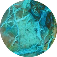
- Ocean tones (turquoise + aquamarine + pearl)

- Earth tones (garnet + smoky quartz + citrine)

These color palettes fit with modern styles like wellness, boho, and minimalism.
Common Mistakes When Pairing Gemstones by Color
Even lovely stones can clash if they are put together incorrectly.
Things to stay away from:
- There are too many bright colors in one piece.
- Equal power of colors that are competing
- Not paying attention to what people say in a low voice
- Combining metals that are warm and cool with stones that have different tones
- Putting too many colors of gemstones into designs

Simple color schemes almost always make things look more expensive and professional.
Starting your jewelry-making journey? Discover the essential tools you need in Jewelry-Making Tools for Beginners – A Comprehensive Guide.
Creating a Gemstone Pairing Chart for Your Jewelry Collection
A pairing chart helps keep collections the same.
How to make one:
- Pick a color for your brand
- Choose the main gemstones
- What are accent stones?
- Give out color schemes that are warm and cool.
- Try to keep the number of combinations in each collection as low as possible.
This helps you make design choices and keeps the look of your brand the same.
Final Thoughts: Making Jewelry That Feels Balanced and Thoughtful
There aren't strict rules for pairing gemstones, but there are some general rules to follow. Being aware of balance, contrast, harmony, and temperature can help you make jewelry that looks like it was made on purpose.
The best combinations of gemstones don't fight with each other. They move. They naturally lead the eye. They think they should be together.
When colors work together, everything else in your design gets better. Craftsmanship is what sets it apart. The stones shine more. The finished product feels complete.
FAQ
Which gemstones naturally complement each other?
Clear-colored gemstones pair well. Clear-colored gemstones pair well. Analogous shades are soothing, complementary pairs contrast, and monochromatic variations add depth. Analogous shades are soothing, complementary pairs contrast, and monochromatic variations add depth. Easy and reliable combinations for beginners are amethyst with rose quartz or turquoise with pearl. Easy and reliable combinations for beginners are amethyst with rose quartz or turquoise with pearl.
How can I match gemstones by color without design experience?
Start simple. Choose one dominant stone and build around it. Either select a contrasting color for impact or stay within the same color family for a refined look. Pay attention to tone and brightness so one stone doesn’t overpower the other.
What are some safe gemstone combinations for people who are just starting?
Amethyst with rose quartz feels romantic and balanced. Turquoise and pearl together make a clean, fresh look. Moonstone paired with labradorite creates a soft, mystical effect. These combinations are forgiving and widely loved.
Which stones work best as accents?
Neutral and light stones make the strongest accents. White topaz, clear quartz, pearl, moonstone, and small diamonds enhance a center stone without competing for attention.
Is it okay to mix warm and cool tones?
Yes, but it works best when one temperature leads, and the other one supports it. For example, a warm citrine center with cool amethyst accents can feel dynamic yet controlled.
Are monochromatic gemstone designs still popular?
Very much so. Using different shades of the same color feels modern, elegant, and easy to style. It’s also a strong choice for luxury-focused collections.
Should gemstone colors match metal tones?
Matching temperature usually creates a polished finish. Warm gemstones pair beautifully with gold, while cooler stones tend to look best with silver or platinum.